So lets just start with this; Trade Show participation is not cheap!
Costs can add up fast; booth space, design and build of your exhibit, on-site show services (electrical, material-handling, set-up labor, etc…), not to mention cost of travel and expense for your own personnel.
And why is it expensive? Because it’s worth it.
The opportunity to market to your target audience in a face-to-face human interaction is what continues to keep trade shows healthy, vibrant and necessary.
With exhibitors all competing for attention on the crowded show floor; everyone is challenged with the same thing…..
“How do I design my exhibit to get NOTICED on the show floor?”
- Keep it SIMPLE. Resist the urge to clutter up your exhibit with complex graphics that will require intense reading. You have maybe 15-20 seconds as attendees are walking the aisle in front of your booth space to attract attention. Your marketing messages and graphics have to be bold and simple enough for that short window of time to have impact. Large, bold text; simple messages; clean and readable fonts. A few short statements will hit harder than your 10-page single spaced brochure. 1 or 2 very large and good quality product photos will be noticed much more than 25 smaller images. Simple, short, concise. If you get noticed in that first 15-20 seconds, you likely have earned the time to actually “present” your products and services.
- You don’t have to attract EVERYONE. While it is great for the show floor and your booth space to be crowded with bodies, it is more critical that you get the “right” bodies in your booth space. When designing your exhibit and graphics, think about what you want to say to those specific attendees that you want to spend time in your booth. One of the challenges at a busy show is that you often have to screen through so many of the attendees that are not going to be “leads” to get to those that will. The more targeted your simple marketing messages can be, the better.
- Be PREPARED. Be ready for the interaction. When your exhibit and graphics have indeed captured the interest of an attendee, be prepared with your short and concise “pitch”, presentation and/or product demo. Product placement and demo areas are extremely important, and need to be considered along with your simple and concise exhibit graphics. Attendees are often trying to get through the entire exhibit hall in just a few hours, and they appreciate exhibitors that provide short and effective engagements.
- Less is MORE. Keep your exhibit space as organized and clutter-free as possible. There needs to be space to freely move around and interact. Attendees will be reluctant to enter and spend time in a space that is cluttered, and will completely avoid any space that looks as if they may be “trapped”. Think of the famous Coco Chanel quote… “before leaving the house, look in the mirror and take one thing off”. This old axiom has been used to create refined style, and the same applies to booth spaces and environments. Resist the temptation to add too much furniture, overwhelm with wordy graphics, or even to add too many booth staffers. You want attention, but for all the right reasons!
- Its not a CIRCUS. Trade shows typically have booth regulations, carefully crafted to put exhibitors on an even playing field. You aren’t allowed to simply go higher than everyone else, or use flashing lights or loud noises to stand out. This is why it is so critical to do a great job with designing your exhibit to be simple, focused, organized and professional. Put your efforts into great design, fantastic graphic content and/or audio-visuals, and you will be a step ahead of those that will try to turn their exhibit into a circus; after all, you throw peanuts, you’ll just get monkeys!
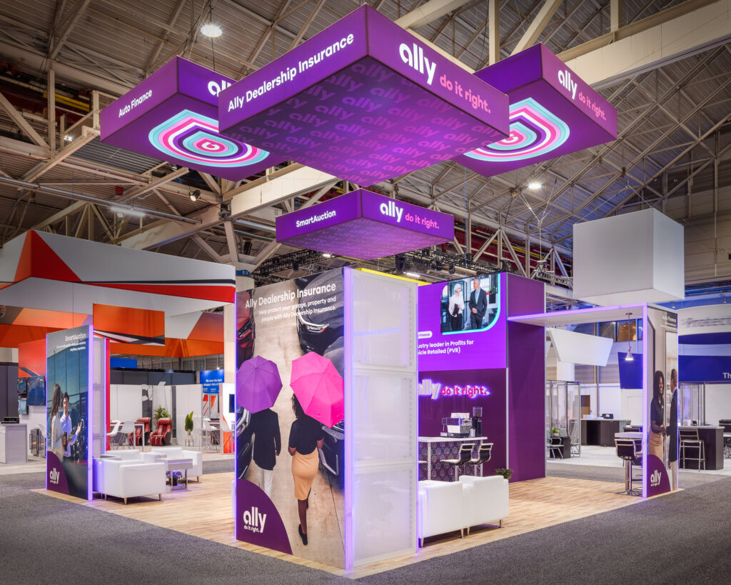
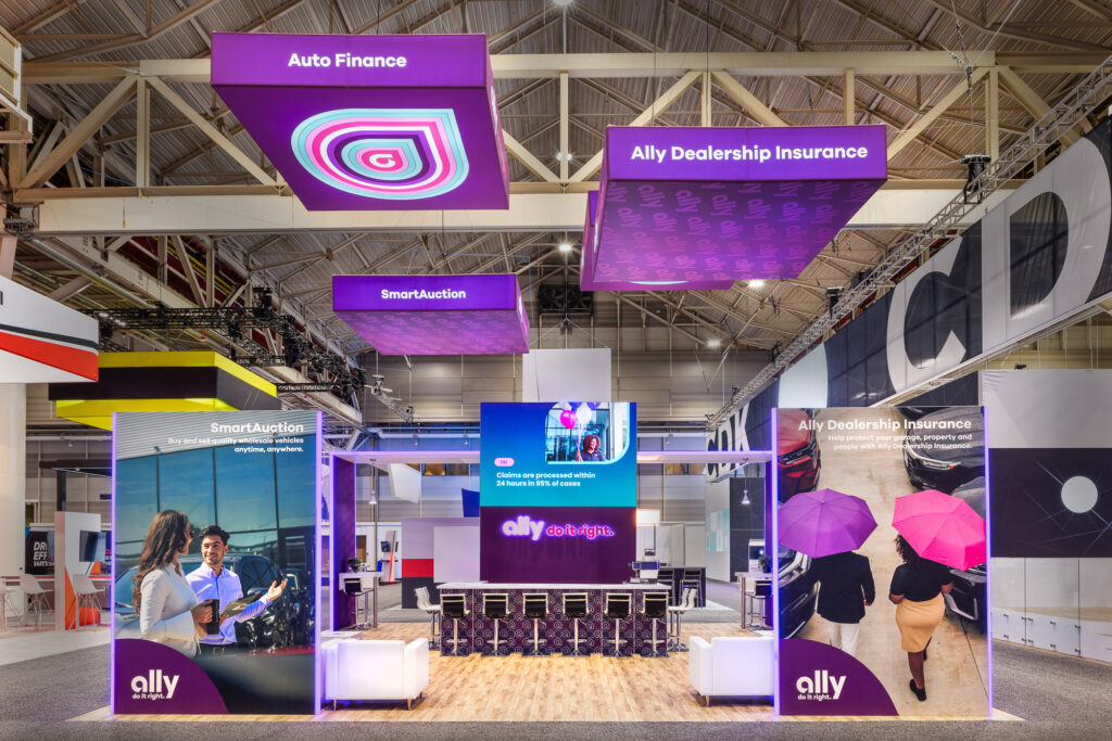
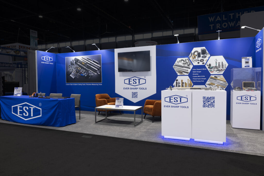
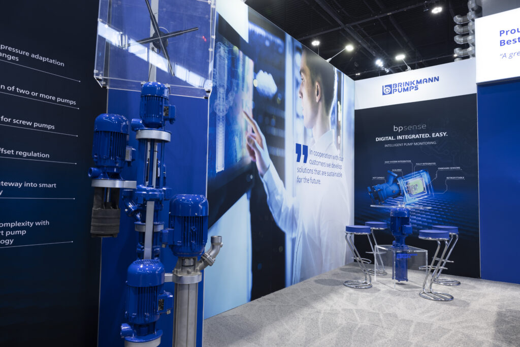
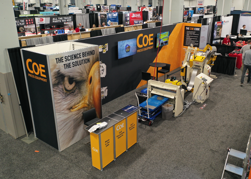
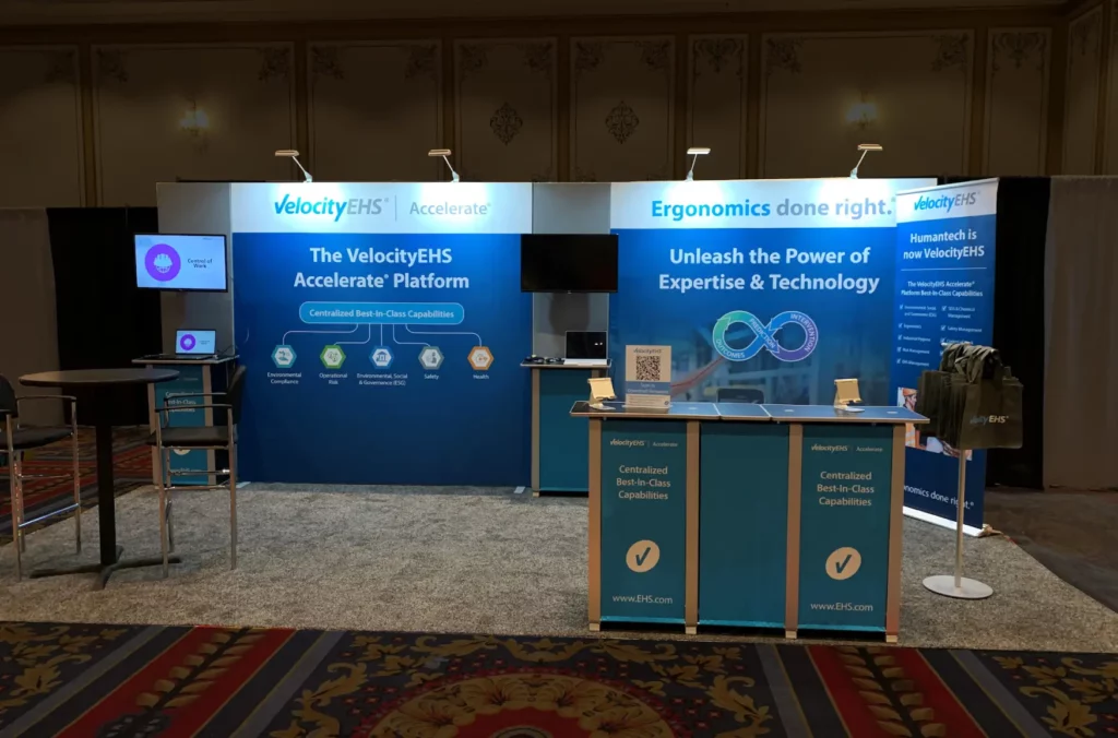
The following are examples of effective booth designs…
For more booth design inspiration, please visit our portfolio page…
https://www.lindsayexhibits.com/custom-trade-show-booths-portfolio/